Welcome to TGIM, Thank God It’s Monday!
Hopefully next week the article will be entitled TBIM – Thank Brady It’s Monday, when the Patriots sunday school the Broncos to hell and back next weekend.
Believe me – don’t be confused by the title of this article or the title of this site. In my mind there is only one god. This man:
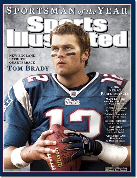
And come next Saturday, he’s going to absolutely destroy the Broncos, on the road to yet another Superbowl!
Football talk aside, what a great day! Today is the day that the kids go back to school! Finally I can actually get into a routine again.
Don’t get me wrong – I love the Christmas breaks and being able to spend time with my kids – but man, it’s so nice to send them packing and have the house to myself! All nice and quiet, and I am pumped with a lot of work planned this week.
Enjoy learning, kids!
I’ve got a lot of interesting projects planned for 2012, and I’m looking forward to getting started on them.
Let’s get cracking so I can start working like a mad man!
Interesting CTA:
I can’t figure out whether this is a good call to action or bad, but it’s an interesting one for sure.
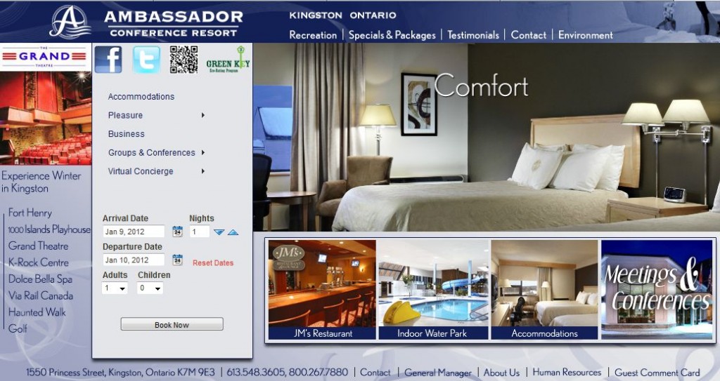
If you visit The Ambassador Hotel Homepage their landing page is this:
The hotel homepage design is a fairly standard(and well laid-out) design with everything above the fold. But it’s that big “Reservation Menu” that really throws me.
The design of it is a stark contrast to the rest of the site, and it really sticks out like a sore thumb. It feels like I accidently hovered over a toolbar menu or something which I can’t make go away.
But is it a bad thing? It encourages interactivity. If you’re looking to book a hotel in Kingston, Ontario you might open up 6 or 7 different hotel websites. This call to action immediately stops you in your tracks, and basically demands you start filling in your arrival and departure dates.
Whether or not it “works” or not is not really the point of this – it’s more a case of when you browse the web, pay attention to everything going on at a website, no matter what website it is. Think about your browsing habits on that website, and what the website encourages you to do.
If you owned a retail store, it’s likely that you’d go to competitive retail stores to see what works for them, and how they have things laid out. The same applies when you’re browsing the WWW.
Link of the Week:
Scott Hanselmans Ultimate Developer and Power Users Tool List for Windows.
Absolutely sick list of software and tools. Take a few hours and just go through everything – long-term it’ll be worth it.
Saying Goodbye to the Things You Love:
Saying goodbye to the things you love can be hard – especially when you’re an internet marketer!
How many of you have built a website up from scratch, put a lot of work into it, gained a lot of pride from the site, and then been unable to name a price when someone comes wanting to buy the website? It can be hard sometimes to separate the “personal” from the “business”. I know over the years I’ve had quite a few offers to buy Affiliate Bible, and I’ve been unable to ever name a price because it’s so hard to look at a site I love like this purely from a numbers standpoint.
Then there’s those websites you’ve put absolutely tons of effort into, but they’re not converting or ranking or working out. It’s hard, but sometimes you have to just let go. That’s what I SHOULD do with CasinoSignupBonus.org – that site is an absolute KILLER at conversions, but in 2.5 years it just is not ranking at all, no matter what I do, and gets an average of 5 visitors a week.
It’s got a decent enough link portfolio, 260+ pages of content, yet no matter what I do it just won’t rank, even for longtail keywords. I’ve invested so much in that site, and with the extremely high conversion rates it’s so hard to say goodbye to it – yet I know I’m going to have to do that at some point.
And then we come to the whole purpose of this section – AffiliateBible.com.
About 18 months ago, I met with a very creative friend and told him I wanted a revamp of the Affiliate Bible design. I wanted something that really pushed my brand, and he came up with this concept. I loved it, and from a visual perspective I just can’t get enough of it. But from a conversion standpoint it’s weak. And as one of my goals on this site is to make money via sub-affiliation, I need to change things up in that regard.
So over the next couple of weeks, expect a whole new design change for Affiliate Bible. We’re going to switch to something similar to CasinoAnswers.com as that is a great converting design.
Sometimes, you just have to sit down and weigh up the pros and cons. And “this design makes me wet” is not enough to counter the various cons that this unique design brings.
lol, Rogers
It never fails to amaze me how multi-million companies can fail at the most basic conversion and retention methods.
I’ll make this story quick – in Canada, we have 3 major cellphone providers in Rogers, Bell and Telus. There are other cellphone providers but none of them even come close to the monopoly that the aforementioned three have.
These companies basically bend over backwards in terms of conversion, and I’m fairly certain some sales reps will give up their first born just to sell you a 3 year contract.
I’ve been with Rogers for about 12 years, and have given them $xx,xxx over that time with two phone numbers under my plan. Now I know I’m not anyone special – I’m just another “account number” to them – but you’d think they’d want to try and retain all of their long-term customers. In the cellphone wars, it’s a LOT cheaper to retain existing customers than it is to sign up new ones.
My contract came up for renewal in mid-December. I contacted Rogers and basically said to them “Look, I want a Blackberry Bold 9900, I’m a long-term customer and want to stick with Rogers. Hook me up with the best deal.” My plan was to give my existing Blackberry Bold 9700 to my wife, and get a data plan for her which would mean I was paying even MORE money to Rogers. I laid this out in the e-mail.
Now I didn’t expect miracles from the beginning – this is essentially a negotiation. I knew for the best deal I’d have to contact Retentions, but I wanted to get a base offer to work from.
Rogers came back and told me they’ll give me a Blackberry Bold 9900 on a 3 year contract for $238.14.
Yet look what Rogers offer new customers:
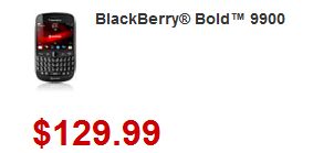
For a 3 year contract, a new customer can get a Blackberry Bold 9900 for $130. For me, a long-term customer who has given the company five figures over the years – it’ll be $100+ more.
I’m all for negotiations, but the worst thing you can do with an existing client base is insult their intelligence. If you have a mailing list for savvy bonus whores for example – the worst thing you could do is send them a crappy signup bonus offer while pretending it’s the best thing since sliced bread. Things like that are hard to recover from – it leaves a horrible taste in peoples mouths.
I know one person who had a 3,000 strong mailing list of sports punters. For every new season of any sport(Golf, NBA, NFL, Soccer etc) he’d recommend them the best “paid tipster” for that sport. He’d get about 500 people going through his affiliate link no matter what sport it was. He had earned their trust for years. And then one day greed got in his eyes, and he sent them a mailer for a sports service simply because they offered a big CPA. This sports service turned out to be a huge scam, and he was never able to win back the peoples trust.
Worse – he had Facebook/Twitter accounts for his service, so people posted all about it on there, and completely killed his reputation.
If there’s one thing you should never do – it’s never insult the users intelligence, whether they’re a new visitor or part of a mailing list. I know when I send out e-mails to my rakeback mailing list, I don’t try and BS them with vague VIP rewards plans or try and dress something up. I remember when I mailed out to them an offer for Lucky Ace Poker rakeback(which goes as high as 36% – but only if you’re a ridiculous grinder) I didn’t try and dress it up – I laid it out for them, and made it clear that they’d most likely only get 10% rakeback back, depending on how much they grinded.
Never insult your audiences intelligence. It’s the biggest turnoff, and they’ll never forget it.
On a sidenote, I immediately switched to Bell. I got a Blackberry Bold 9900 for free, a Blackberry Curve 9360 for free, double the data, lots of additional bells and whistles – and I pay even less than what I do to Rogers.
And being treated like a valued customer always goes a long way.
Video of the Week:
With the kids off for Christmas, we watched our fair share of movies. While they were into all that Pixar animated crap, I was able to force some good old 80s down their throat. We watched The Wizard about 3 weeks ago, yet I’m STILL quoting this every day:
So great. See you next week for Thank Brady It’s Monday!.

 Dealer Dan, pictured here with WWE Superstar Mick Foley, has been in internet marketing since 1996. He likes hugs, long walks on the beach, and making money while wearing his jammy jams. For more information, you can read all


