The term “above the fold” in relation to a website, is what people see when they first visit a website prior to scrolling down or interacting with the website in any manner.
This is the first initial impression of a website and is arguably the most important aspect of the design process.
Of course, this also depends on your primary objective for users. If you go to Facebook for example, the only thing they currently offer is a login box, or the option to create a new account or page. This is because they don’t need to sell you on Facebook at all anymore. They know a user’s primary purpose for going to the homepage is to either log in, or create an account.
At a book site I run where you can follow authors and get notified of new books that they release, above the fold is simply the logo and then a search box. This is to really push our branding from the off, as well as encourage people to immediately interact with the site. Once they have taken that first step, they are more likely to sign up and follow an author.
Here at Affiliate Bible, I have a different approach in regard to how I write content and attempt to monetize the site. This is more of a personal preference, but I run this site primarily as a passion project as I enjoy offering advice and teaching people. I feel it would lose its effect if I started squeezing in ads for affiliate programs or tools for affiliates every few paragraphs.
So instead, I offer quality content that is advertisement free but instead have a big call to action above the fold instead, highlighting an affiliate program or tool. It may not be optimal for me in regard to monetizing the site, but monetization is a secondary goal anyway. My primary goal is quality content and advice. Plus, it is very appealing to advertisers to know the amount of real estate they are getting to display their brand.
It’s always fascinating looking at above-the-fold content on gambling sites, particularly when the overall content is the same. Search for a random online casino with the word review in it, and compare the differences. It’s interesting to see how they have the same information but are presented in different manners.
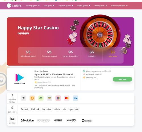
One that really stood out for me recently was Casilife.com and how they present theirs. Now, this site is actually in Japanese so I’m converting it to English via Chrome. However here is how their above-the-fold looks for a review of Happy Star Casino:

Now, this was a happy (pardon the pun) accident, but initially, I clicked to visit them via their roulette casino section, where they listed Happy Star Casino as the best roulette casino. I initially thought that the roulette wheel was based on that click. Alas, that is not the case. That’s a thought for people out there; depending on the keywords people use to find the casino review, or where they click from, it would be a cool idea to dynamically generate images above the fold based on that.
Or if that is too much, then pick one casino as your “best roulette casino” and then make the casino review all about roulette.
Back to this above the fold.
First, what I really like is how it cuts off at the bottom. This is its own section entirely. It’s almost saying to the user “this is all that you need to know”. You don’t need to know anymore. It’s like a “cheat sheet” to get the low down on this online casino, with all the bases covered. Most other sites have the rest of the review attached to it and it feels continuous. Other sites are practically inviting people to scroll down. This is something different, and I much prefer that.
It of course holds all the important information that a player needs to know. They cover:
- Ratings for the important aspects of a casino, with an overall rating
- Brand mention, title stating what the page is, the logo of the brand
- Wagering requirements mentioned, and an additional focus on mentioning withdrawal speed and reliability
- The usual gambling regulation stuff required these days
- Information about the deposit bonus
- Payment methods available at the casino
- Game types available at the casino
- Software providers for this particular online casino
What I like about this is that they have done their due diligence. For this particular audience, they know that withdrawal speed is important so they have mentioned it not once but twice above the fold. Small things like that really stand out.
They also went with a very clean approach to it. It’s a simple design, but it stands out and looks professional. The placement of the logo, the logos of payment methods, and the software providers – it all works together so well. Then the usage of icons to add to it such as for the star rating, or the wagering requirements.
It’s presented almost like an information card – and practically all of the information a casino player needs if they are considering Happy Casino is within this section.
The official look to it really adds to it as well. I like that they don’t try and cram in too much such as casino game screenshots. We all know what a casino looks like – no need to see random pictures of it in action.
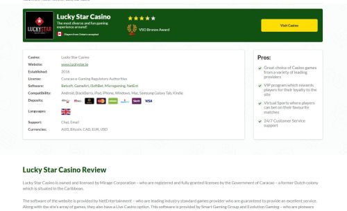
I don’t want to appear negative about any other affiliate websites out there, but I do want to highlight a few above the folds that I feel pale in comparison compared to Casilife. Here’s one example:

This one offers a lot of the same information as the Casilife review and the presentation is okay. If I created that, I’d be happy with it. That is until I saw the Casilife Above the Fold. This one just has so many words, and really leads into the review meaning it’s less likely people are going to think “This is all I needed” and click to play. It’s the opposite at Casilife.
If you run a website with casino reviews, really take the time to look at what you list above the fold and its intent. It feels like too many affiliates these days attempt to cram too much information in there, then lead to the actual review. The fact is that you should be able to sell people on an online casino with as little information as possible.
Less is more is never more applicable when it comes to above-the-fold content.

 Dealer Dan, pictured here with WWE Superstar Mick Foley, has been in internet marketing since 1996. He likes hugs, long walks on the beach, and making money while wearing his jammy jams. For more information, you can read all


